ShopDreamUp AI ArtDreamUp

Deviation Actions
Daily Deviation
Daily Deviation
January 16, 2011
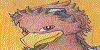
Owl Archer by ~yurionna. "
This is a very beautifully drawn deviation. The lighting and shading is perfect, and the feathers were drawn with great detail. The muscles and curves are well defined. The necklace was also drawn quite well.
I must say, this is a great anthro drawing."
Featured by Pixel-Spotlight
Suggested by Blue-Bird-1494


Comments144
Join the community to add your comment. Already a deviant? Log In
You requested a more thorough critique on this picture, so I'll try the best I can to help you out with the entire piece. To do so, I will take steps dealing with every part of the picture until I've covered it all. I suggest you make yourself a nice cup of tea or coffee while you read, because you've got quite a wall of text to cover! Please don't forget to read the little bit at the very bottom.
Anatomy
We'll start with the anatomy, since it's crucial for any character to be built up from a good solid base. Without a decent underlying structure, we can’t properly paint what lies on top. What's probably more important than getting right the muscles, is getting right the proportions. The arms seem to be a bit long, or the torso and legs should be a little longer to match the arms. Overall however, the body isn't your biggest problem, as you seem to have some decent understanding of anatomy. I would say that the wings need the most work done. However pretty they have been rendered, they are not built up as actual avian wings would be.
Take a look at this photograph. If you're unsure about something, always look up references. There is no shame in using them, even the greatest of the great use them when in doubt and there really is no other way to learn. Either way, let's have a look. The first thing that should immediately be apparent is the difference in width and shape of your wings and the actual owl's wings. Owl wings are very solid, broad and rounded. This (among other things) helps them to fly as silently as they do.
Know that bird wings are basically arms with feathers, this might be helpful for you to visualize their structure. Also notice, although this may be a little harder to tell, that the flight feathers (the primaries and secondaries, if you don't know them, you can easily look them up) are only connected to the “lower” wing arm and the wing “hand”. My redlines should make this more clear.
Click here to see the wing redlines.
Now that we've covered the wings, we'll move on to the body. As said, there are a few issues with the proportions, but also the muscles and the placement of the limbs. A lot of this has to do with the arms and the position of the hips and the legs. I know the pose you're going for and it took me a while to find a good reference, but eventually found something, as you can see here. Notice how the leg overlaying the other is directed upwards, then downwards and the foot points forward. If you can't find a good enough reference, find yourself a mirror and assume the position yourself. Proportion wise, it's easier to shorten the arms than to lengthen the entire body, so that's what I did. A useful guideline would be that the elbows reach down to the waist or the underside of the ribcage, and the wrist would be on crotch-level. I'm afraid I can't really teach you how musculature works in a simple critique, but Andrew Loomis does it pretty well. I suggest you look up his “Figure drawing for all it’s worth” on Google.
Click here to see the skeleton/structure redline.
Click here to see the muscle redline.
And that's that I guess, so much for the anatomy!
Composition
This will be a short paragraph, but it's an important one regardless. I won't be including it in the final paintover, but for future reference, remember that a completely center-focused composition makes a picture very static and often uninteresting. Your character is right in the middle of the picture which doesn't really invite the viewer to look any further. This might have been your intention, but it would have added a lot to the picture if you extended the canvas and lead the viewer's eye around.
Click here for a composition example (thumbnail).
Values (light, shading & contrast)
Despite the picture being mostly complimented for it's lighting and shading, I actually think this is one of the areas where it can be improved the most. It may have to do with the way you build up your pictures or your knowledge of atmospheric perspective/depth, or a combination of factors. Either way, I will start with the basics.
Atmospheric depth is fairly simple to explain and understand, namely the further away the object, the more it loses detail and fades into the color of the background. The background in this case is the sky. From top to bottom, the sky has a dark to light gradient due to our atmosphere. For a nice effect this gradient can be exaggerated a little. Whatever is in the foreground will stand out strongly against the background.
Click for a basic atmospheric depth example.
Notice how depth can be suggested with simple forms and gradients. I kept your owl face because let's face it, it's too pretty to lose ^^. Now comes the difficult part though; how does the light source (the moon) affect it's surroundings and where does it cast light? I'm not going to go into detail because a lot of this you will simply have to figure out for yourself, but there are a few things I guess I can explain.
First, the glow of the moon. The glow will never be so bright that the entire shape of the moon is lost, so I'm afraid you exaggerated it a little. To get a nice, subtle but convincing glow, pick a soft brush on a low opacity (say 20%) that is roughly two or three times the size of your moon, color pick your moon (or just pick white) and click over your moon a few times until you are satisfied with the glow.
Second, rim lighting. Rim lighting is nothing more than a bright edge of light around your object caused by "concentrated" highlights. This only happens with sharp or thin edges which the light source is directly behind. Remember atmospheric depth; this applies to rim lights too. The further away, the less bright. This will automatically make your foreground objects stand out much more.
Click here for a glow & rim lighting example.
Now the picture is getting somewhere! I'm going to go ahead and skip a lot of explaining, as I assume you understand the basics of light and shading. I noticed you applied some good knowledge in your work, such as where the shading starts it's at it's darkest, and reflected light. The only problem there is that you really need to visualize your character as a 3D form in a 3D environment and try to carefully work out where light would hit and where it wouldn't. You could draw a few "light-ray" guidelines coming from the moon to help you estimate where the light will be, as I feel this was giving you some trouble. The same goes for reflected light, when you've pin-pointed where your reflected light will come from (this can be light bouncing off of nearby branches for example, or reflected from mist below), it might help to draw some guidelines coming from that source leading to your character.
I left out a lot of feathering and details which you had in your character design just to keep the paintover simple. This is pretty much it though. You can “finish” the picture by adding textures if you want to, for example on the nearby tree branches, or add other finishing touches such as mist, clouds, or possibly stars just to add a little bit of interest and details to your painting.
Click here to see the final paintover.
------
So far for the critique! I'll be pretty amazed if you were able to stay focused through all of it, but I sure hope you have.
I would like to add to all of this that I'm in no way pretending that I'm an expert at anything (in that neither my anatomy or my lighting is perfect in any way). I've simply done my own bit of studying and practicing in the past and felt that I might be able to help you out on certain areas, or at least open your eyes to possibilities. I hope it's appreciated and I wish you good luck with your next piece! <img src="e.deviantart.net/emoticons/s/s…" width="15" height="15" alt="